Display data geographically, with bubbles used to represent values: the larger the bubble, the larger the value. This is a good way to visualize variations in the given value across a geographical location, particularly if you are measuring several member elements. While you may want to see data for a single element, selecting multiple elements from a single hierarchy will split the bubbles into pie charts. This enables the user to understand variations.
Building a Bubble Map
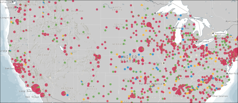
The example in the screenshot below shows Sales by County, with the Product Category member represented by colors. Each bubble represents that country's product sales, but each bubble is also split into segments representing the proportion of sales for each product category.
Geocode Bubble Maps
Geocode maps convert geospatial descriptions (like country, city, address, etc) into locations on the map. To build geocode bubble maps, simply add the required geospatial hierarchies to the Map Location drop zone; each member element in the hierarchy will be represented by a bubble on the map.
Add multiple geospatial hierarchies in a logical order to populate the map with 'lower level' locations. For example, if you want to see cities, you can add Country, then State, then City; a bubble will be generated for each city within each state that exists in the query whose parent country also exists in the query.
Example
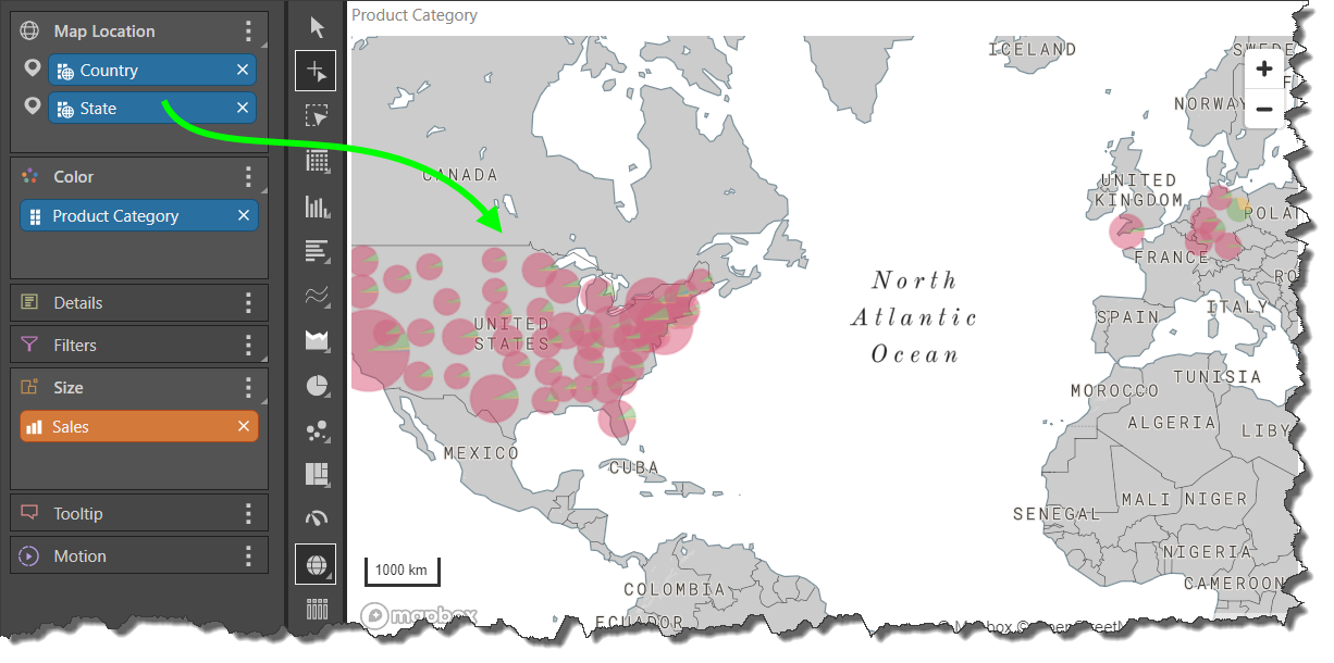
In this example, a geocode bubble map representing product category sales by state was built.
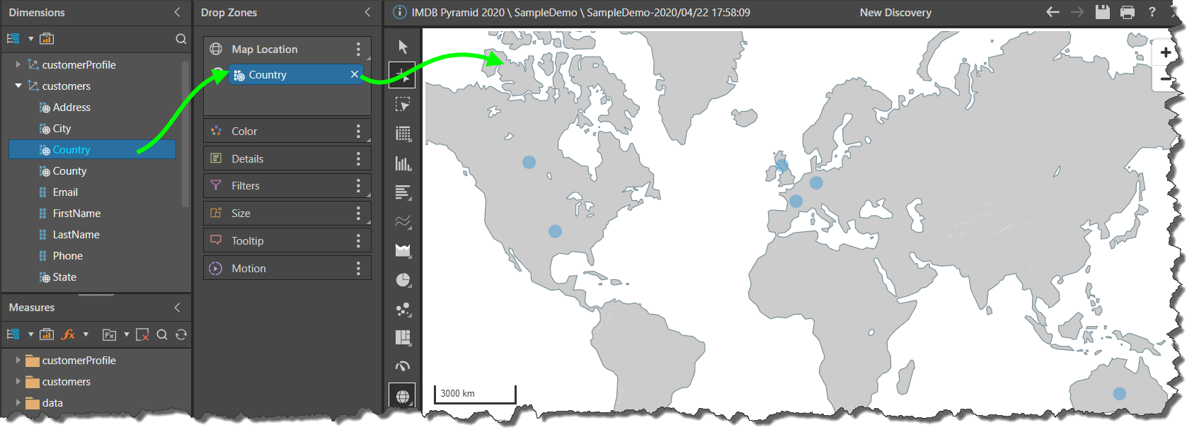
Step 1
Add the Country geocode hierarchy to the Map Location drop zone. Each country in the hierarchy will be represented by a bubble on the map.
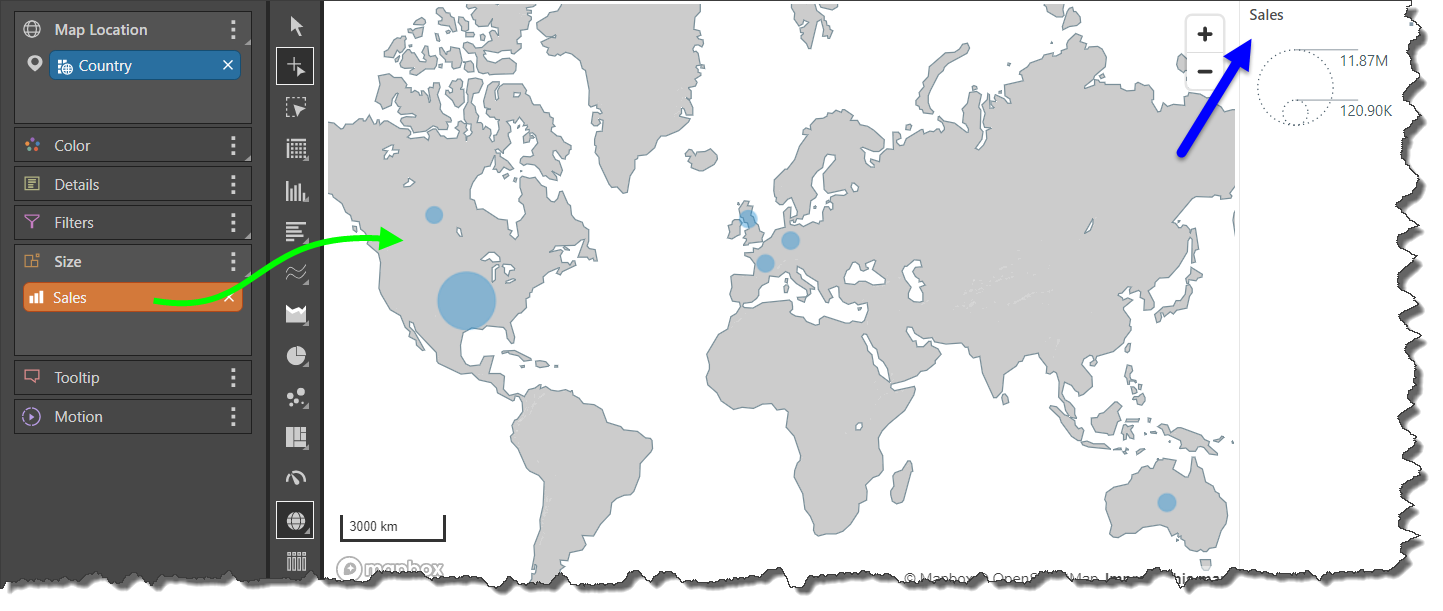
Step 2
Add the Sales measure to the Size drop zone; the size of each bubble will now be driven by its value in sales.
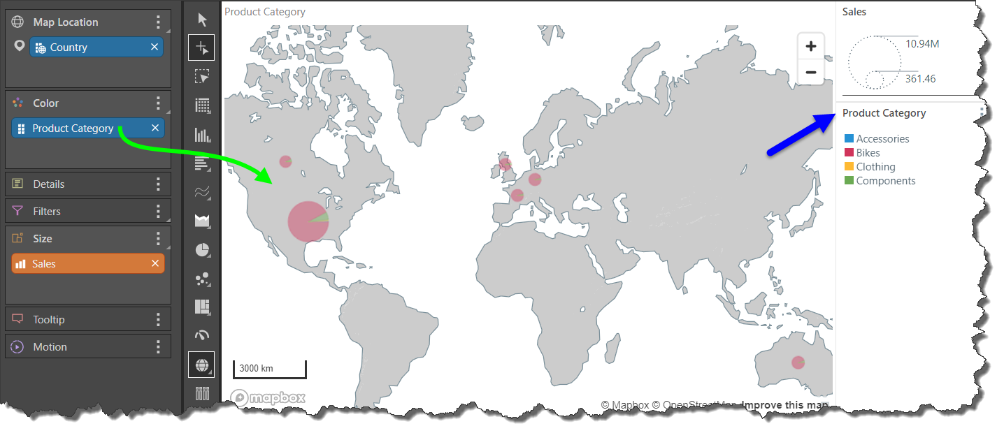
Step 3
Add the Product Category hierarchy to the Color zone; each bubble will now be split into a pie chart, with each segment representing a product category.
Step 4
Add the State geocode hierarchy underneath the Country hierarchy; each state in each country will now be represented by a bubble pie chart.
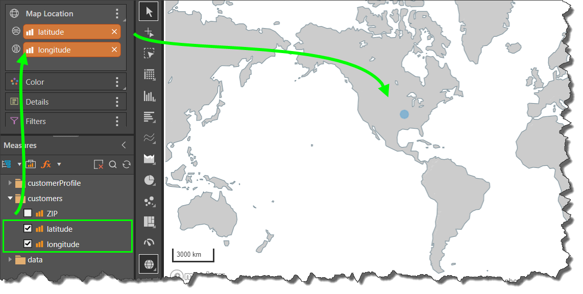
Latitude / Longitude Bubble Map
Maps can be build based on latitude and longitude coordinates, rather than geocode hierarchies. To use latitude and longitude data in this way, your data model must contain latitude and longitude measures.
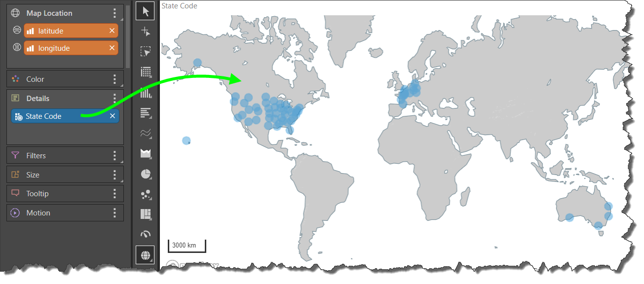
Once the latitude and longitude measures are added to the Map Location zone, a hierarchy containing unique identifiers for you coordinates must be added to the Details zone. The coordinates will then be mapped according to the corresponding unique identifiers.
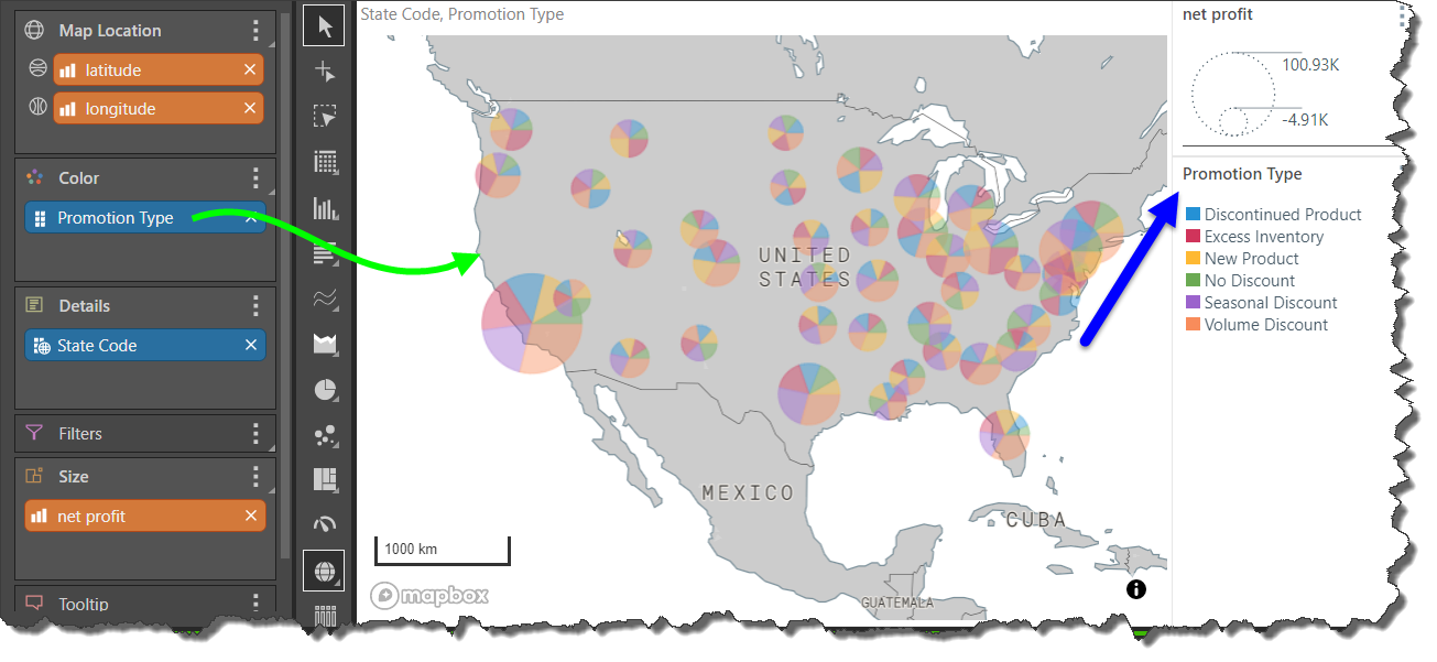
Example
In this example a latitude/ longitude bubble map was built, showing net profit for promotion type by state.
Step 1
The Latitude and Longitude measures were added to the Map Location drop zone. A single bubble represents the aggregation of all latitude and longitude coordinates.
Step 2
The State Code hierarchy was added to the Details zone; a bubble is generated for each latitude/ longitude coordinate that corresponds to a state code.
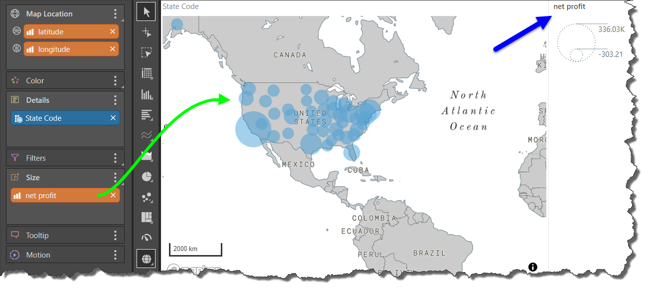
Step 3
The Net Profit measure was added to the Size drop zone; , so that the size of each bubble is driven by the net profit for those coordinates.
Step 4
The Promotion Type hierarchy was added to the Color zone to split each bubble into pie segments representing each promotion type.
Formatting a Bubble Map
When working with bubble maps, there are several formatting options that enable you to design the map according your needs. For example, you can select the specific map type, customize the map colors, add zoom control buttons, and more.
- Click here for more information about Bubble Map Formatting